Analyzing Apple's newest user interface announcement
Veteran designer Robert Andrei critiques Apple’s new “liquid glass” UI, highlighting accessibility failures and the dangers of trend-driven design.
NEWS
I’ve been doing design for over 15 years, and if there’s one thing I’ve been consistently avoiding, it’s watching big tech events and product launches.
I don't like marketing trends that don't solve real problems.
Although Google, Apple, Microsoft and many others have been upgrading the machine scene for many, many years, these events have shifted from "Here's a new device that will help you with x, y, z problems in your daily life" to the disappointing todays "We’ve changed the UI to ‘liquid glass’ and added a few buzzwords that don’t actually mean anything”.
I honestly thought this was a joke or some marketing scheme to drive attention to them. I still do. I honestly can’t believe Apple shipped this new UI with a straight face. They do have a tendency to ship some features years after Google or Microsoft and it's sad when they market those features as "new edge technology".
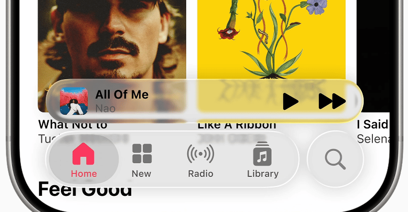
But let's take a closer look at the hero image and analyze it:
✅ It's clean & minimal - that's it. That's the strength.
⚠️Low contrast - even for regular users that don't have any disability.
⚠️There are still small touch / hit areas: Some people have bigger finger tips.
⚠️There are no text labels in some cases which could confuse first time users or screen reader software.
⚠️Floating UI - because why not distract the user even more instead of letting them to complete an objective or a problem.
⚠️A lot of visual background noise. A lot.
So to summarize this new "outstanding" UI from Apple:
Color Contrast ❌ Fails
Touch Target Size ⚠️ Borderline
Screen Reader Friendly ❓ Unknown towards ❌ Fails
Cognitive Load ❌ Fails
For those unfamiliar, there are established guidelines that help us design for real people, not just trends. The WCAG 2.1 (Web Content Accessibility Guidelines) explicitly require sufficient color contrast, readable text, and compatibility with assistive technologies like screen readers. Apple’s own Human Interface Guidelines (HIG) emphasize clarity, simplicity, and legibility. Even Google’s Material Design framework recommends minimum touch target sizes of 48x48dp to ensure accessibility across all devices.
What we’re seeing here ignores or barely meets many of these standards, especially for users with visual, motor, or cognitive impairments.
When we ignore these standards in favor of visual flair—like translucent backgrounds with low contrast or ambiguous floating controls—we’re not just making a visual decision. We’re actively making the product harder to use for millions of people. That’s not innovation. That’s negligence.
Remember everyone (Designers, BA's, PO's, Stakeholders): Design is about solving problems, not chasing trends. If Apple, or any company, wants to lead with design, they should ensure new UI changes respect accessibility, usability, and actual human behavior. A beautiful UI is only meaningful if it empowers users, not distracts them.
Let’s build interfaces that serve people, not marketing departments.